For three decades, Chris Crofton at Functional Art has created innovative ways for interior and exterior spaces to function, not only delivering optimal solutions reflective of each client’s unique sense of aesthetics, but also maximizing efficient use of pre-existing design resources.
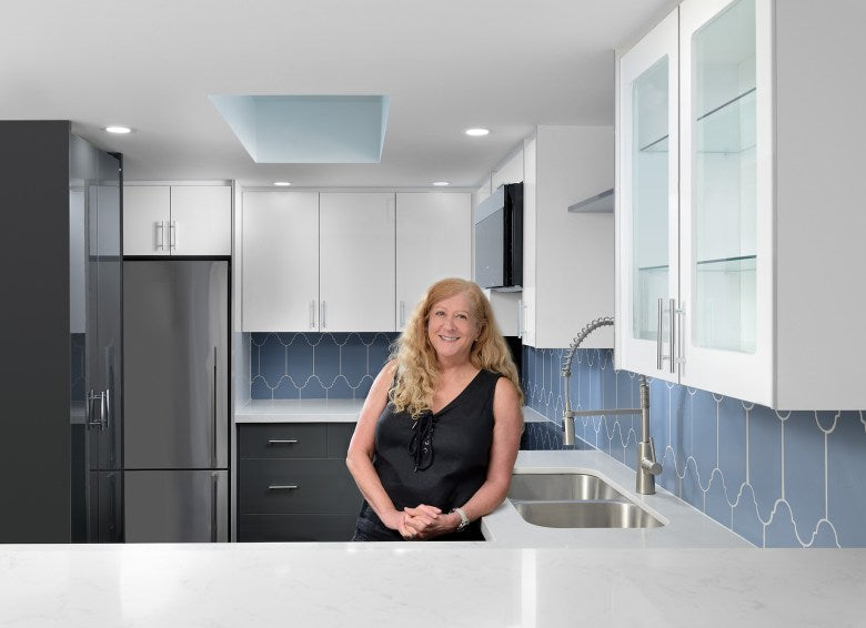
“It is an amazing feeling when you collaborate with a client in identifying their actual needs, and creating vital living spaces that allow them to realize their dreams and mirror who they are.
Our homes need to provide us with much more than shelter from the storm. They should be welcoming harbours at the end of a demanding workweek. In this unprecedented time, we need serene havens where we feel comfortable spending increasingly longer periods.”
Following graduation from the Ontario College of Art, Chris became an advertising art director, working primarily in television. However, she also began coordinating renovation projects and creating one of kind pieces of furniture — Functional Art. Client demand soon required her full time commitment, not just to furniture design, but also to the conception, planning and construction of living spaces, both inside and out.
While most of her projects have focused on renovating existing buildings in many of Toronto’s vibrant neighbourhoods, a number have also included new home construction for leisure or retirement purposes in rural communities outside the city, province and country. Chris is always keen on expanding her knowledge and experience and recently took the Age in Place certification to further make sure that all spaces she works in are designed to function in the best possible way.
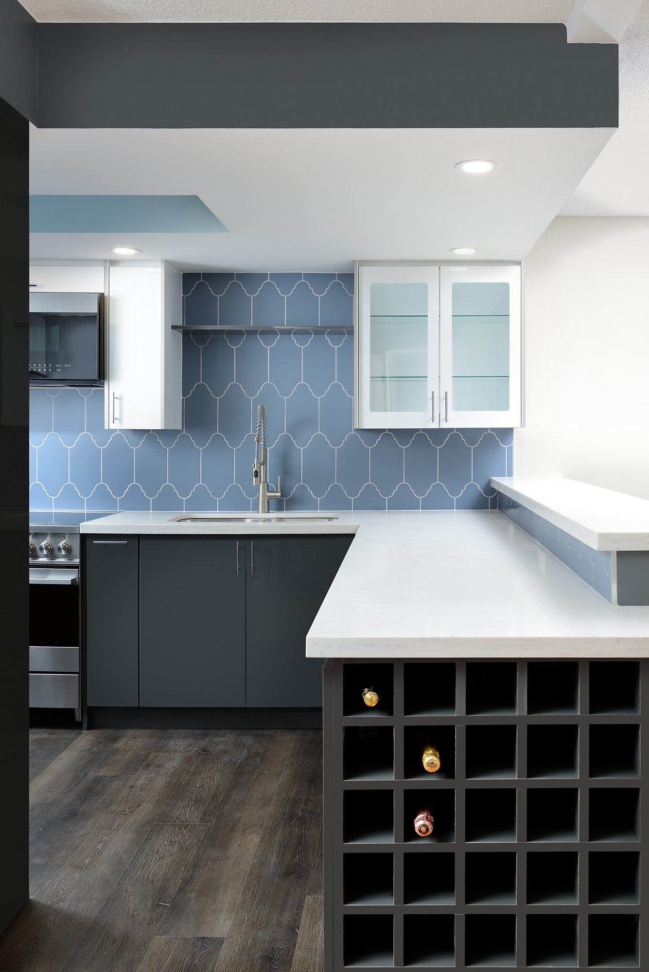
This project was a full kitchen and bathroom renovation of a dated, thirty-year-old condominium for a professional chef with plans to make it his forever city home.
Hard to imagine, this remarkable kitchen was once a dimly-lit room with a single overhead light, poor quality cabinets and dysfunctional appliances.
The transformation began by creating a new layout, taking advantage of three walls which tripled the working counter space.
Opening up what had been a pass through increased the availability of natural light and the addition of new pot lights and under cabinet lighting provided a range of options for safely lighting any task or creating ambiance while entertaining. The new luxury vinyl plank flooring not only looks amazing, but is also virtually indestructible and comfortable to stand on for long periods of cooking time.

The kitchen’s small footprint meant choosing ergonomically-friendly lower cabinets with drawers over doors and no dark corners for things to get lost in. Deep upper cabinets along the back wall meant the large restaurant-sized dinner plates the chef preferred have a permanent position and a floor-to-ceiling pantry making everything easily at hand.
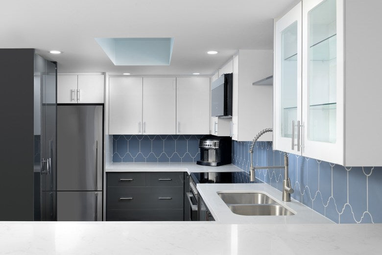
Each appliance was carefully chosen for it’s feature content , size and flush design. The Fisher & Paykel 13.5 c. ft. fridge with internal icemaker was a perfect choice because it is multifunctional. The bins can be removed for entertaining to create more space for platters and with ActiveSmart Technology, food stays fresher longer . There was no compromise on features with this smaller refrigerator.
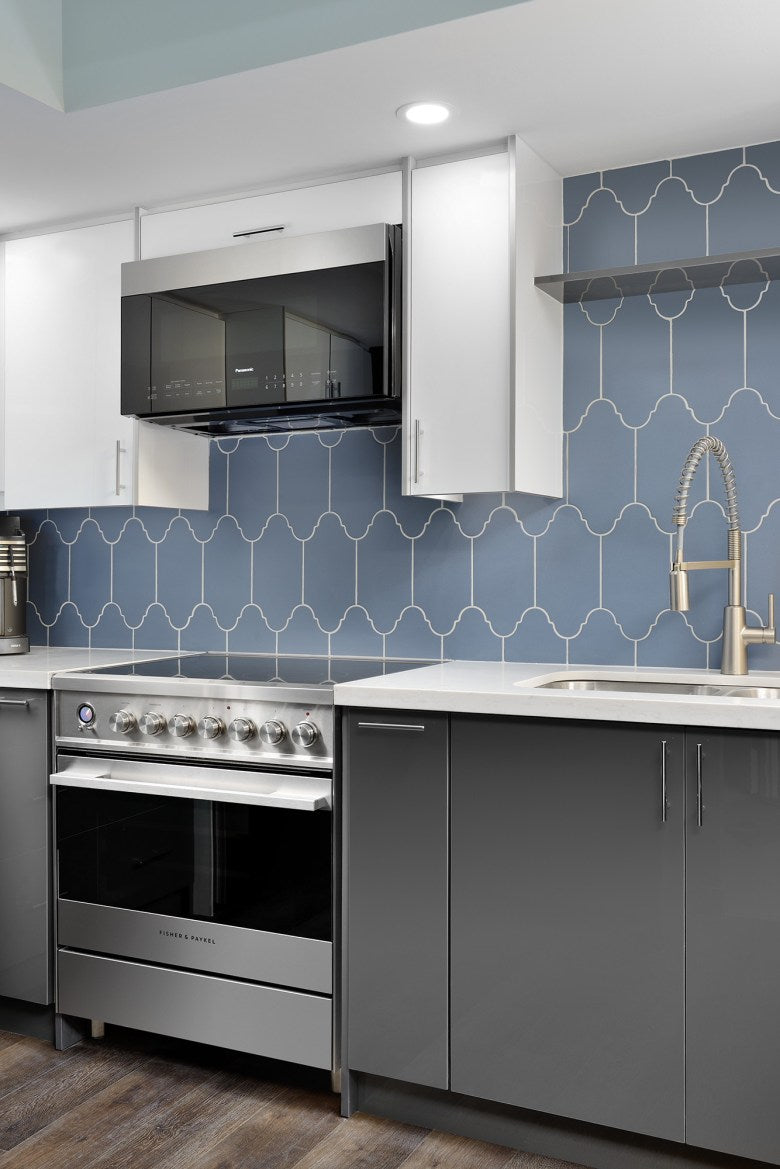
Any chef requires a range that has all the features needed to create magical food experiences. The elegant look of the Fisher & Paykel 30 inch electric range with convection made perfect sense , because it is fully featured with a flush design. This range may be 30” in size, but it has a large oven capacity, nine oven functions, and is self-cleaning.
A Panasonic Over than Range Microwave is a great way to save space in any design because it is a two- in- one appliance, taking the place of a ventilation hood while having equal or better venting power than some hood fans – boasting 400 CFM. This model has no handles which help to complement the look of the range.
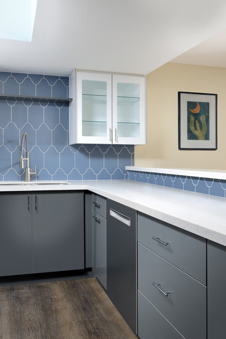
The dishwasher for this design had to meet two criteria for this kitchen. One – it had to be extra quiet, as the living space is not large, and two – it had to be discreet in it’s appearance with hidden controls so the logical choice was the Bosch 500 series 24” dishwasher with Aqualeak protection and adjustable racks to customize loading space.
The new appliances are top notch performers – they had to meet the demands of a professional chef in a limited size footprint – Diane excelled at making suggestions which would meet all the homeowners needs.
Easy to maintain flat-panel doors were finished in two high-gloss colours with non-porous quartz counters set against blue Moroccan tile to create a truly unique cooking and entertaining space for a discerning and budget conscious client. Whether it’s two or twenty, cooking is comfortable and efficient and the chef can interact with his guests in an aesthetically pleasing and functional space.
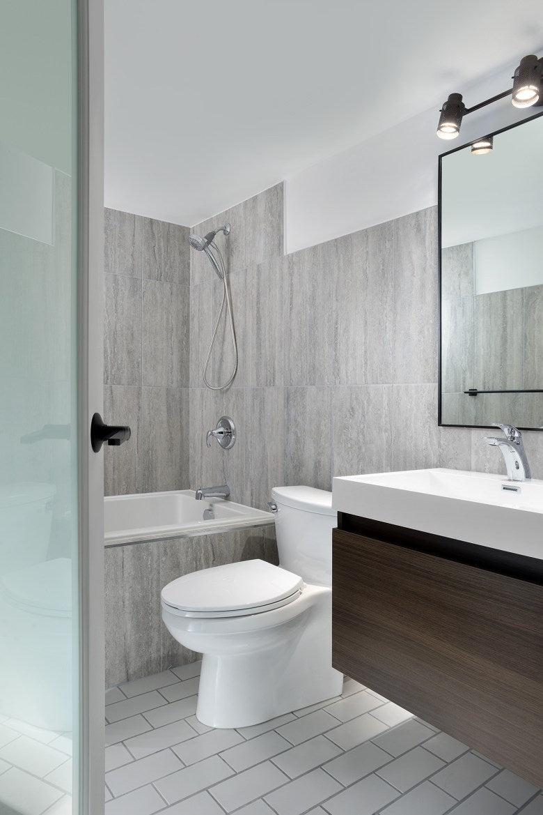
The bathroom had the same problem as the kitchen, a small footprint that couldn’t be changed, inefficient storage and dated non functioning fixtures. Tiles were used on all the walls to create a backdrop for the floating vanity, skirted toilet and deep drop in tub. The floor is the original – a matte subway tile that just needed new grouting to work with the modern porcelain on the walls which saved time, money and landfill.
Like the kitchen the bathroom is low maintenance and clean up is a breeze.
Visit Functional Art’s website at www.functionalart.ca and follow Chris Crofton on Instagram @functional_art_to
If you are designer who wants to partner with some appliance specialists, please call us at 1-800-303-755 or email Ta_help@taappliance.com to get set up today!

